The Lorenz curve, named after its inventor, is a graphical representation that shows the distribution of a variable (assets, wealth, income, etc.) within a population. More specifically, it represents the distribution function that associates each population fractile[1] with the share of wealth held by that fractile. In other words, it represents how much of a variable is held by a given portion of the population.
When the Lorenz curve is used to represent the distribution of income within a population, the latter is generally divided into ten fractiles. These are referred to as population deciles. The first decile represents the poorest 10% of the population, the second decile the poorest 20%, and so on.
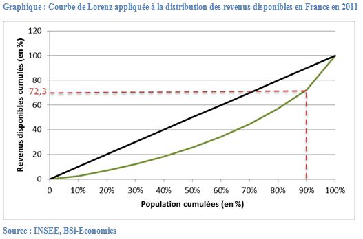
The graph below shows the Lorenz curve when applied to the distribution of disposable income in France in 2011 (green curve). According to this graph, we can see that the poorest 10% of French people, or the first decile, hold 2.6% of the total disposable income of the French population. Conversely, the richest 10% of French people hold 27.7% of total disposable income or, in other words, the poorest 90% hold 72.3% of total disposable income.
The black line represents the situation in which the distribution of disposable income would be perfectly equal. That is, when the poorest 10% would have 10% of total disposable income, the poorest 20% would hold 20% of total disposable income, and so on.
David Marguerit
Notes
[1] A fractile divides a population into equal parts. For example, if a population consists of 150 people and is divided into 10 fractiles, each fractile will consist of 15 people.